Evaluation
In
what ways does your media product use, develop or challenge forms and
conventions of real media products?
 For
my Film Trailer, I chose to look specifically into the supernatural horror
genre looking into the way the different stylistics can shock and scare the
audience. I was inspired by music videos such as Insidious, Paranormal Activity
and Blair Witch Project, which were very clever at prolonging sequence to make
the audience feel fear. I chose to look at these three film trailers in
particular to study the way they used to stylistics, I found that they used
soundtracks rather than songs, and text on screen rather than dialogue. For my
film trailer I planned to create a very fast paced film trailer which used a
constant soundtrack in the background, I did not feel that any songs would be
appropriate for my coursework. In order to avoid this becoming a film, I had to
make sure I broke all continuity available, I also had to make sure there was
no focus on a star because that is seen more in comedy film trailers, I have to
make sure the focus is on the possession.
For
my Film Trailer, I chose to look specifically into the supernatural horror
genre looking into the way the different stylistics can shock and scare the
audience. I was inspired by music videos such as Insidious, Paranormal Activity
and Blair Witch Project, which were very clever at prolonging sequence to make
the audience feel fear. I chose to look at these three film trailers in
particular to study the way they used to stylistics, I found that they used
soundtracks rather than songs, and text on screen rather than dialogue. For my
film trailer I planned to create a very fast paced film trailer which used a
constant soundtrack in the background, I did not feel that any songs would be
appropriate for my coursework. In order to avoid this becoming a film, I had to
make sure I broke all continuity available, I also had to make sure there was
no focus on a star because that is seen more in comedy film trailers, I have to
make sure the focus is on the possession.One of the codes and conventions of the film trailer for the supernatural genre is to try to generate fear and shock into the audience making the audience feel uncomfortable watching at the same time as an inability to look away. For example in the trailer for woman in black they are attempting to strike fear into the audience to make them want to continue staring at the screen. This is something I thought was important to imitate in my music video as I feel it is part of the iconography of the Supernatural Horror Genre. For example in this trailer, we cans ee particular focus on the main star Daniel Radcliffe, we can see short cuts of young children, however the true focus is upon the star and showing the scariest scenes of the film in a fast paced montage.
This is a concept I worked hard on in my film trailer. I tried to only show my protagonist within the scenes so it is obvious to the audience from the start of what they should expect to see in front of them.
For the mise-en-scene I chose to use an old fashioned three story house down Westbourne Avenue. I chose to use this house because of the mise-en-scene it allowed me to have. Within the house I chose to use hallways and staircases as the prime shooting locations. Stairs connotes leading to the unknown, I chose to make my protagonist walk up the stairs as if he is walking into the drama at his own accord.
Overall I filmed all my footage on 5 different occasions; they began on October 2012 and finished in March 2013, with the overall amount of footage adding up to around 3 hours.
With all of the shots of my characters, the intention was for it too look very fast paced, almost confusing at the same time, the trailer should have enigma, so I only used footage that made the enigma more interesting. Some examples of my intention to create enigma are long shots of an interview and close ups. Within the close ups the character is never smiling, showing that he is very unhappy with his life. The extensive planning that I did before filming helped me to create these effects, before shooting I took raw footage to see how my trailer would look. I discovered through this project that camera angles help to create the mood, when practicing I found that close ups work more effectively than long shots.
One of the first problems I faced was that my strict plan that I had written in order to make sure I follow the codes and conventions was not as easy as I thought to follow. One example of this was the juxtaposition of the shots, on my animatic I used shots next to each other that I was happy with, this was the shot of my character as a child then as an adult, however, now when editing them together on Adobe, they do not look as clear as once thought, the images do not seem to work together as well, when asking my audience they did not understand the transition. I had to change the order of the shots to make sure that they made sense.
Another convention of Film Trailers is the use of weapons, the weapon is often seen through a close up and/or a point of view shot. The weapon will have been spotted by the individual and it will tend to be a knife, gun or saw, to indicate that there is going to be danger and violence coming up. Along with this expect hurt and pain. In a supernatural horror film this is not always the case, it does not always have to be a physical weapon because it may be a spirit that is causing the harm and therefore it cannot be seen. In order to abide b this convention I had to show doors slamming and chairs moving on their own, this shows the presence of a spirit in the room.
It is important to use a varied amount of camera angles within a film trailer, the varied angles help for the audience to stay entertained, which is something I made sure that I did within my trailer. There are many close ups, extremes closes ups, high angles and tracking shots as a way of showing the audience the action in a number of different ways. I also wanted the audience to feel involved in the trailer, this is something I found upon researching, in order to do this I had to take the shots as if it was being filmed by a friend, making the audience appear to be that friend that is watching. The fact that my protagonist is a young male will make the audience feel more involved, they will relate to that scenario of being scared in an old house.
Typing into youtube “outtakes” there is a lot of videos that are edits of the raw footage put together in a funny way, I have also decided to do this to show the scenes that did not work when filming, one particular scene which was the protagonist walking up to the door, that took 6 takes because of reflexion and keeping the shot steady. To create the outtakes video, I used the same editing software (Adobe Premier Pro CS6) and had to look through all of the footage I had and edited it together using the same soundtrack that I had used in my trailer.
How
effective is the combination of your main product and ancillary texts?
To create my ancillary texts, I had to take 15 photographs of my protagonist in different clothes and also using a different facial expression, I uploaded each of them to my computer so that I could use them. I used a Sony Cybershot Camera. I tried different styles on Adobe Photoshop CS5 to try to get the image to a standard of which I was happy with. I tried different fonts but also different artistic styles; changing the image to Sepia, Black and White but also enhancing the brightness and the sharpness. The image I chose to use was my character with his hand against his mouth.
I felt that they looked trapped and shocked in that image and it displayed what some enigma which is what I wanted the audience to see, this is therefore linking my poster with my trailer, shocking the same image, but also showing an image from the trailer itself. After I had this image saved I then began to experiment with different effects, I added an image I had of a forest and I applied it a layer above the image of my character.
Focusing on the word 'Within', and moving away from my original stimulus of Paranormal Activity has changed into an original idea following more and more research into my sub-genre theme of super natural.

I began by adding my photo to Photoshop my photo was taken during the filming of my film trailer, this is an image from the trailer itself. The hand coming onto his mouth is him being silenced, but also an image of him keeping the devil within him, because it is desperate to escape - he is been possessed.

I then used a photo I had take in the local Forrest, over the county road flyover, Hull. I did not need permission to take these photos, however, I did have to make sure I took them during the day to get the correct lighting for the shoot.

I added my image to photoshop, focusing on one tree in particular that is very think and 'spiny'. I felt that this coming up through the image is very clever and connotes the split in his new found personality. In order to change this photo into this effect, I used the 'filter' button, and then the artistic, and then the 'brush strokes'. This made the photo become very dark and mysterious, although it is very clear what is set within the scene, it is very different to the original image. This differs from the original white background that the photo has.

To make sure this photo could be seen, I went onto my image of my actor, and using the rubber tool, I faded the edge of the image to make sure that the forestry could be seen clearly. I did this by carefully zooming in on the image and cutting out the white that was in the original photo. I felt this was much better than looking at the original image.

To achieve this, I made sure that this layer could be seen above the layer of the Forrest I then changed it to the 'linear light' opacity. This made the image clear however I was still unhappy with it, the connotations of green are too happy and I felt that it was unnatural for this image to be shown in a super natural trailer.
Although, I did feel very happy with the achievement of the tree running directly down the centre of his nose.

In order to get the image darker, I had to make the 'background' layer shown to the specatator, having this turn up made the image become darker and the face become red however the other half become see through.
This was the idea I had planned in my image because it showed the two sides to his personality, the devil within alongside the person that he still is.
 After I was happy with my image I added text to it, with the film being called 'Within' it was hard to choose a text font. So I decided to add the 'Lithos Pro' font in block white so it could be seen across the whole image. I then had to change the opacity so it didn't stand out too much. I changed the opacity, to 57.
I then added my name to the image, showing it as directed by me personally in red writing and above 'Within'. I had to also turn down the opacity of this writing to make sure it then didn't stand out too much but would stick in with this text. Below, I am very content with this poster and feel I am ready to move on to my film trailer magazine.
After this image I decided to get rid of the text that said 'Directed by Bethany Hirons' because I didn't feel it was appropriate.

I added the date tthat the film will be produced, which is the 32.06.12, and I also chose to add names under the text, I did this by adding text layers to the image and stacking them as appropriate. I also chose to use names of friends as standard text so it ticks all of the boxes of what is done in the posters that I looked into.

First of all I began with this image, I had to go stand outside of the college gates and take a continual group of photos with an extremely fast shutter speed. This image came out the best and using Photoshop I enhanced it to make it look bright as today is a very dull day.
I then began again, adding my first layer:
 |
| Add caption |
I used an empty layer and turned it purple, I did this because I extensively studied 'empire' film magazine, a magazine that unlike in my first year where I learnt to use the white background, I used a purple background. On top of this image I added my digital imaging of the cloud. Then by scaling the image I made them the same A4 size.

I then turned up the saturation of the image, I did this because it made the clouds lose the texture of being a cloud, but it created a pattern in the background ready for my to edit my magazine front cover. I zoomed in to the image of the cloud, particularly into the gaps in the cloud so it would create a paint brush effect.
I did this because I felt it looked much more effective than just the purple background:


As you can see through looking at both of the images, adding a texture to the background looks much more appealing and like a magazine that would be expected to cost £4.
the image was taken from a photoshoot in the green room at college, using the white background I took several image of my actor.
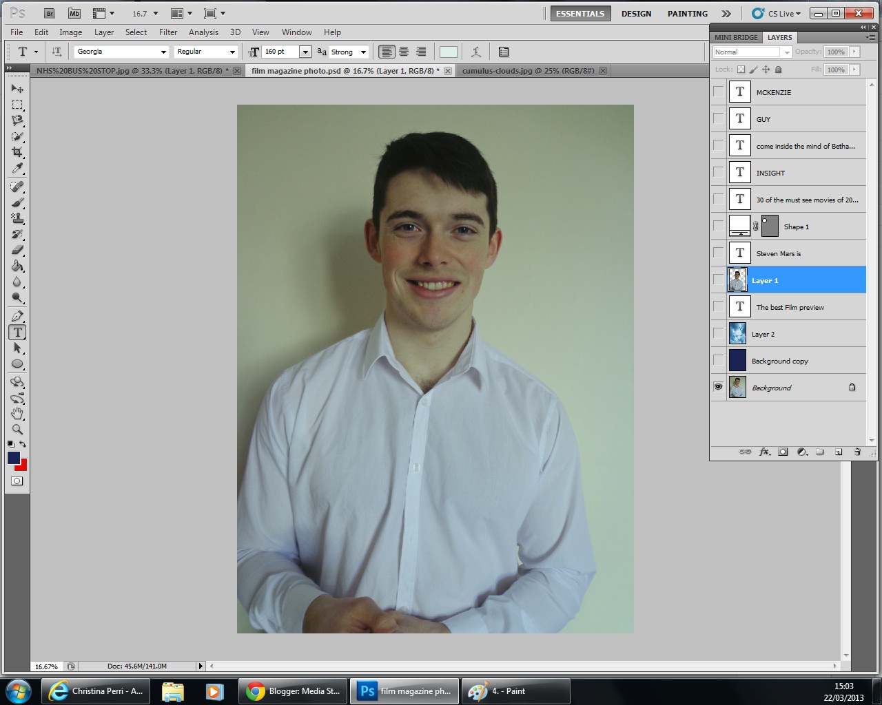
My favorite of which is this one below because of the angle it was taken and also because of the hand movements, very similar to that of Robert Downey Junior on the cover of Empire.

I then added the masthead, 'insight' magazine sounded much better than the original idea of 'cloud' magazine. Although cloud magazine was found on a synonym checker, I felt that insight was much more eye-catching.
However, I had to make a change because I did not want these letters in front of the image:


I then added text above the masthead which is there to entice the reader to buy this magazine. when doing research not all film magazines use this, it is no longer a convention, however, I felt it appropriate to make sure I have one. Total Film however, using a minimalistic approach, which means they use their main image to entice the audience with barely any text.

Part of the brief stated that this magazine would have to include our film trailer, so to be specific I put not only my actor on the front cover, but also by naming him on the front cover. I used black font to stand out on his shirt.

I then added an advertisement bubble, this was made to put information inside.

The information I made to be put inside this bubble is information that says 'The most watched films of 2013'. This is used to help the audience know what to buy and what they want. It is almost half way through the year and getting people to buy such films is a tactic used by the distribution companies.

I then added text at either side of the model.

After adding text to the right of the screen, I then turned the opacity down on the text so that it is not as vibrant as the text above. I used the colour white to stay contrasting with the main image.


I then added text to the left of the screen, this was to make the empty spaces dissapear, looking at film magazines that used texts, I found that they would have minimal gaps around the main image. using Empire magazine as an example, they have no gaps at all, including images as well as text.
I chose not to include images because I felt it would have too much too look at.
Along with this I also included a bar code, the bar code is essential when the consumer is buying the film magazine.

What have you learned from your audience feedback?
I decided to use interviews of individuals who fit my target audience, using both male and females aged between 18 and 24, I used opportunity sampling so that my feedback would be as realistic as possible. Alongside the video footage, I also made written questionnaires featuring open and closed questions.
From my feedback I have learnt that my film trailer has not fit into my desired conventions, this has being explained because my trailer has not established a story line within the diegisis. When I asked what genre they thought my film trailer was aiming to achieve, they replied that they were not sure because it had no followed the codes and the conventions thoroughly. However, when I asked about my ancillary texts, I found that my audience found them effective. Particularly my film poster, which when asked if they felt it was appealing 80% of my audience said yes.
To improve my main product, from my audience feedback I have learnt that I could have used a better camera, in order to improve the footages' quality. Some of the scenes were shot using artificial lighting, and therefore they appeared grainy on the screen. If I were make this again I would re-shoot these scenes with a better camera and also using natural lighting. I could also use more locations, using just two locations was one of the things my audience stated in their feedback.
Another improvement I could make is to make the trailer more fast paced, apart from the end sequences, there is no real fast paced editing, the scenes and long and drawn out. The conventions of a supernatural should cause fear into the audience, but the problem with mine is that it does not do that. One of my audience members stated that he was expecting more from my trailer following my ancillary texts. He stated that my ancillary texts were excellent in performing in the conventions, but my trailer was not, following this feedback, I would make improvements to the ancillary texts aswell. For my magazine in particular I could have changed the background colour because it was not appealing to the eyes. My aim with that was to bring be like the magazines I had studied which used dark colours, however, I did not achieve that successfully.
On the poster I could have included a web address for the audience to go to look into my project further, this is typically a convention but something I forgot to mention, furthermore I also forgot to use both facebook and twitter advertising techniques. These are both simple and effective methods of advertising because they are the cheapest, they spread word of the mouth the fastest and also appeal to my target audience on a personal level. It is known that over a billion people use facebook , it would of being an easy way to produce an audience. If I were to make my poster again, these are things I would keep in mind.
From my poll on my Blog, I found that 91% of my audience was female and 100% of them were aged 16-24. The expectation of my audience was for males to primarily watch the supernatural genre, and this was seen to be true when on my poll, the most common genre that my audience were interested in was the romantic films. This did not match my character profiling that I had originally planned out. However, the methods of which my audience would fil=nd my trailer was correct. I stated that my audience would use Youtube, Facebook, Twitter and Blogging websites to see film trailers, and my poll showed this to be true.
How did you use new media technologies in the construction and research, planning and evaluation stages?
My first media technology I used was www.blogger.com, this was the website that I have used in all of my stages of production, I have used it to monitor my progress and to evidence the work that I have being doing.


